You know that feeling?
When you’ve launched something — your course is live, your landing page is done, and you’re staring at the stats thinking,
“Why aren’t more people signing up?” That’s where J was — a smart, motivated creator with a great course on building habits. They had traffic. They had content. But something in the experience was turning visitors away. They asked me for a quick UX mini-audit — no redesign, just honest feedback. Here’s what I found (and what might help your own course page too).
What Wasn’t Working — And Why It Matters?
J’s page wasn’t broken. It had all the right pieces:
-
- A decent headline
-
- Course modules
-
- Testimonials
-
- A call-to-action button
But in UX, it’s not about having the elements — it’s about how they work together.
The page looked fine, but it didn’t feel right. It didn’t guide. It didn’t build trust. It didn’t convert.
So we made 3 small changes that made a big difference.
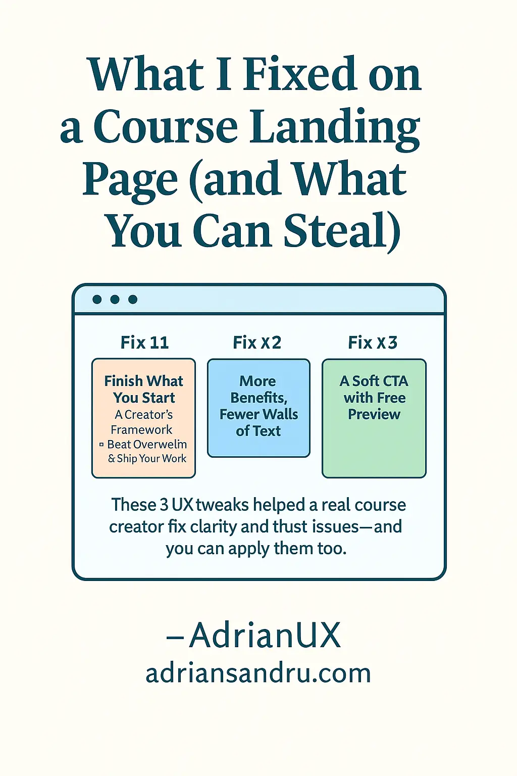
Fix #1: The Headline Was All Facts, No Feel
J’s original headline was:
“Learn Productivity Skills from a Creative Pro”
Okay. But it’s not emotional. It’s not urgent. It doesn’t speak to what the user wants.
We rewrote it to:
“Finish What You Start – A Creator’s Framework to Beat Overwhelm & Ship Your Work”
Now it speaks directly to the learner’s pain point — and their goal. That emotional clarity makes people stick.
Fix #2: Walls of Text That Pushed People Away
Below the headline was a huge block of text explaining every lesson.
No breaks. No hooks. No air to breathe.
We broke it down using:
-
- Bold mini-headings for each module
-
- One benefit bullet per section
-
- Occasional emoji for tone (if it fits your voice)
The idea: make it scannable. People don’t read, they scan. Let them find their reason to say “yes.”
Fix #3: The Only CTA Was ‘Buy Now’
That’s a big leap for a cold visitor. If they’re 80% convinced, they’ll still bounce.
So we added a micro-conversion:
“Try the free preview lesson — no signup needed.”
This helped users test the experience before committing.
Result? More click-throughs. More trust. Less pressure.
What You Can Learn From This
UX isn’t about redesigning your entire site. It’s about removing what’s in the way of understanding and trust.
If your page isn’t converting:
-
- Check if your headline speaks to desire — not just facts
-
- Break long text into chunks — give people clarity at a glance
-
- Add a soft CTA — not everyone is ready to buy cold
Sometimes a 5-minute audit can change the way your content feels — and that’s everything.
Want a Free UX Mini-Audit for Your Page?
I offer a short, focused audit of your course page, product page, or audiobook listing.
Here’s what you’ll get:
-
- A 1–2 paragraph review of your page
-
- 2–3 UX changes you can apply instantly
-
- All based on real best practices — no fluff, no upsell
👉 Request your free UX audit here
🔒 Privacy Disclaimer
I’ll only use your info to deliver this audit — no spam, no tracking, just real feedback.
🖋️ Brought to you by AdrianUX
Smart UX for Course Creators and Digital Publishers
adriansandru.com